
Shape VS Colour
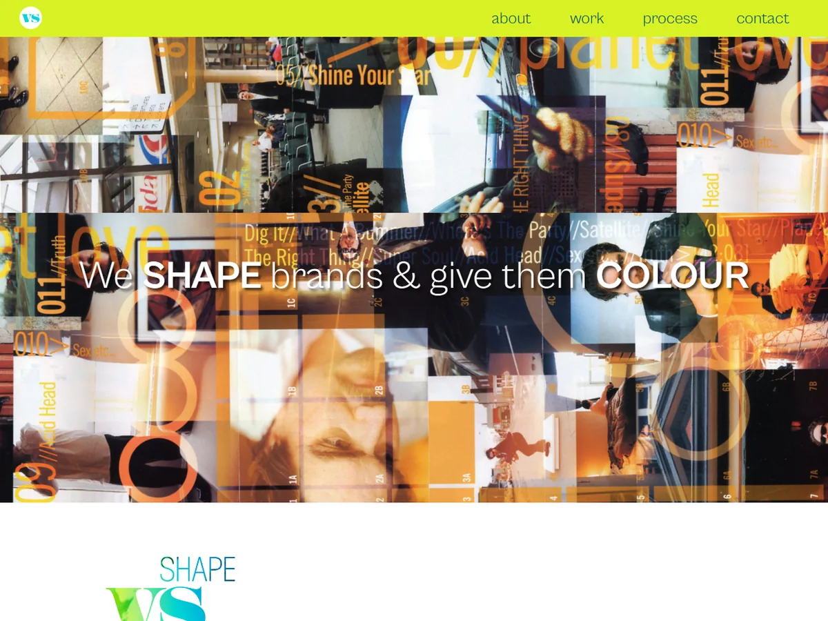
A portfolio-first website for a Toronto design and brand strategy studio led by an award-winning designer with 25+ years of experience.
- Client
- Shape VS Colour
- Sector
- Design studio, Toronto
- What we did
- Portfolio website
Overview
Shape VS Colour is a Toronto studio that creates design and brand strategy for clients across architecture, aviation cargo, construction, education, fashion, food and beverage, healthcare, interior design, music, retail, sports and technology. The studio's principal, Steve Goode, is an award-winning designer and art director.
The brief
- Let the work speak first, across very different industries and formats
- Translate a strong offline brand philosophy into an equally strong digital presence
- Keep the site easy to update as new projects are completed
What we delivered
- A visual, project-led layout where each case opens into a full story with large imagery
- Typography and spacing that stay out of the way of the work
- WordPress with a simple content model so the studio can add projects without a developer
- Performance work so image-heavy pages still load quickly on mobile
Outcome
A website that showcases the studio's multidisciplinary approach and diverse clientele, and that the studio can maintain itself.

More work
World Immigration Network Inc.
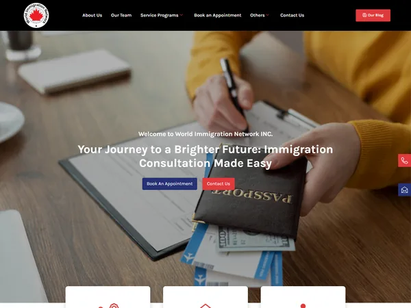
A search-optimized WordPress website for an immigration law firm with a 22-year track record in Canadian immigration law.
Read the case study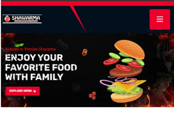
Premium Shawarma
A menu-driven restaurant website with online ordering and pickup and delivery scheduling for a family-run Mediterranean restaurant on Danforth Avenue.
Read the case study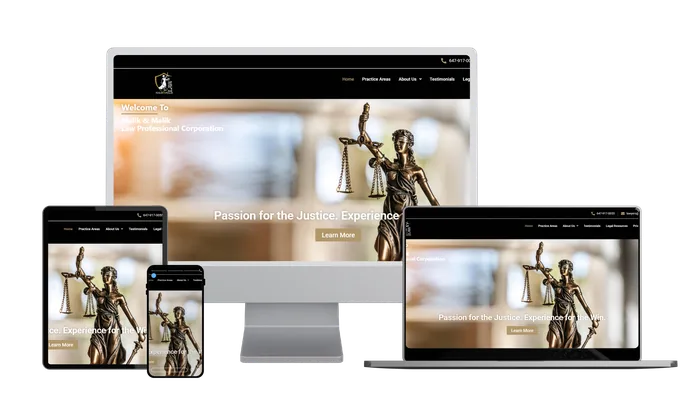
Malik and Malik
A professional website for a full-service Toronto law firm covering civil litigation, real estate, immigration, family law, wills and estates and criminal defence.
Read the case studyPlanning a website or platform?
We will show you the most relevant examples and outline an approach within a day.